Bug: Min Budget Not Shown When Set To 0
Hey guys, let's dive into a peculiar issue spotted in our real estate app! It seems like the budget minimum isn't showing up when it's set to 0, which could potentially cause some confusion for our users.
The Problem
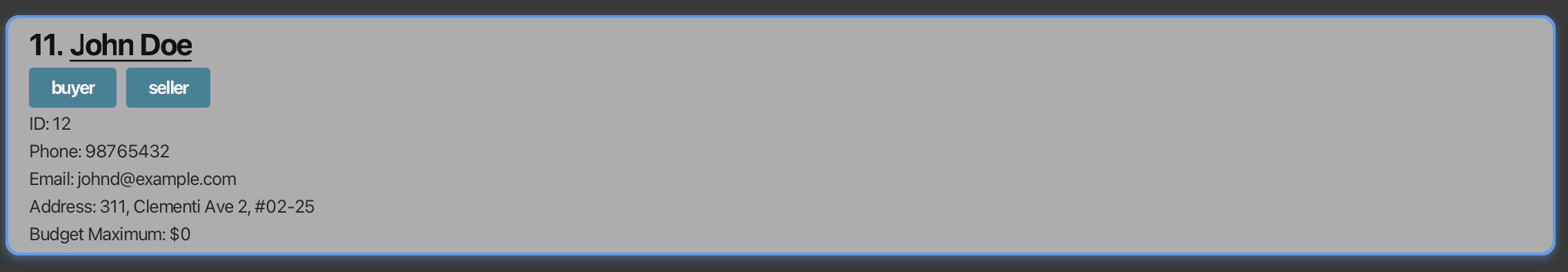
So, here's the deal. A user tried adding a contact with a budget minimum of 0 using the command:
addcontact n/John Doe p/98765432 e/johnd@example.com a/311, Clementi Ave 2, #02-25 t/buyer t/seller min/0 max/0
Now, the contact did get added to the list, which is good news! However, the budget minimum wasn't displayed, even though the budget maximum was shown as 0. You can see what I mean in the image below:
Why This Matters
Now, you might be thinking, "It's just a zero, what's the big deal?" But think about it from the perspective of a real estate agent using our app. If the budget minimum isn't displayed, they might start second-guessing themselves.
- Did they actually set the minimum to 0?
- Or did they just forget to set it altogether?
This uncertainty can lead to wasted time and potential errors. Imagine the agent accidentally showing a property outside the client's budget simply because they weren't sure about the minimum! We want to avoid these kinds of situations and ensure that our app is as clear and intuitive as possible.
Consistency is Key
Another thing to consider is consistency. The budget maximum is displayed when it's set to 0, so why not the minimum? Having this inconsistency can feel a bit jarring and can make the app feel less polished. Striving for consistency in our design and functionality is super important for creating a user-friendly experience.
Proposed Solution
So, what's the fix? Well, the solution seems pretty straightforward: we should display the budget minimum even when it's 0. This simple change can make a big difference in clarity and prevent potential confusion. It would provide the user with a clear confirmation that they intentionally set the minimum budget to 0.
Think of it this way: displaying the 0 for the minimum budget acts as an explicit statement, leaving no room for ambiguity. It's like saying, "Hey, I know what I'm doing, and I specifically set this to 0!"
Severity and Type
This issue has been labeled as severity.VeryLow and type.FeatureFlaw. While it's not a critical bug that's crashing the app or causing major data loss, it's still something we should address. It falls under the category of a feature flaw because it's a minor imperfection in the way the feature is implemented. Addressing these small flaws can significantly improve the overall user experience.
Let's Make it Better!
In conclusion, displaying the budget minimum when it's set to 0 is a small but impactful change that can enhance the usability of our real estate app. It promotes clarity, consistency, and ultimately, a better experience for our users. Let's get this fixed and make our app even more awesome!
Okay, let's zoom out a bit and talk about the bigger picture. Why is displaying zero values important in user interfaces (UIs) in general? It's not just about this specific bug in our real estate app; it's a principle that applies to many different software applications and systems.
The Power of Explicit Information
At its core, the importance of displaying zero values boils down to the power of explicit information. When we design UIs, we want to make sure that users have all the information they need to make informed decisions and take appropriate actions. Leaving things implicit, or relying on users to infer information, can often lead to mistakes and frustration.
Consider these scenarios:
- E-commerce: Imagine you're shopping online, and a product has a discount code field. If you don't have a code, and the field simply disappears or remains blank, you might wonder if you're missing out on a potential discount. But if the field explicitly shows "0% discount applied," you know for sure that there's no discount code available.
- Financial software: In a budgeting app, if a category shows no spending, it's better to display "$0.00" than to leave it blank. This clarifies that you haven't spent any money in that category, rather than suggesting that the data might be missing or incomplete.
- Data visualization: In a chart or graph, zero values should be clearly represented on the axes. This provides context and helps users accurately interpret the data.
In all these cases, displaying zero values eliminates ambiguity and provides a complete picture. It tells the user, "This is the actual value, and it's zero. There's no hidden information or missing data."
Preventing Errors and Misinterpretations
As we saw in our real estate app example, hiding zero values can lead to errors and misinterpretations. When a value is not displayed, users might make assumptions or guess what the value is. These assumptions can be wrong, leading to incorrect actions.
For instance, in a form with multiple fields, if a zero value is not displayed, the user might think that the field is optional or that they haven't filled it in yet. They might then try to enter a value, even though zero is the correct value. By explicitly showing the zero, we prevent this potential confusion and ensure that the user understands the current state of the system.
Consistency and User Expectations
We've already touched on the importance of consistency, but it's worth reiterating. Users develop expectations based on how an application behaves. If some zero values are displayed while others are not, it can create a sense of inconsistency and make the UI feel unpredictable.
By consistently displaying zero values, we create a more coherent and user-friendly experience. Users know what to expect, and they can rely on the UI to provide them with accurate and complete information.
The Role of Context
Of course, there are situations where displaying zero values might not be necessary or even desirable. The context of the application and the specific information being displayed play a crucial role in this decision.
For example, in a highly complex data visualization with hundreds of data points, displaying every single zero value might clutter the display and make it harder to see the important trends. In such cases, it might be better to use a different visual representation, such as highlighting zero values or using a logarithmic scale.
However, in most cases, especially in data entry forms and user interfaces where accuracy and clarity are paramount, displaying zero values is a good practice.
Best Practices for Displaying Zero Values
So, how should we display zero values? Here are some best practices to keep in mind:
- Use a clear and consistent format: If you're displaying numerical values, use a consistent number of decimal places, even for zero values (e.g., 0.00 instead of 0). This makes it easier for users to compare values and ensures that zero values don't get overlooked.
- Consider the data type: If the value represents a monetary amount, use the appropriate currency symbol (e.g., $0.00). If it represents a percentage, use the percent sign (e.g., 0%).
- Use visual cues: In some cases, you might want to use visual cues to highlight zero values. For example, you could use a different color or font weight to make them stand out.
- Test with users: As with any UI design decision, it's important to test your approach with real users. Get their feedback on whether the way you're displaying zero values is clear and effective.
Conclusion
Displaying zero values is a small detail, but it can have a big impact on the usability and clarity of a user interface. By providing explicit information, preventing errors, and maintaining consistency, we can create applications that are more intuitive and user-friendly. So, let's embrace the zero and make sure it gets the visibility it deserves!
Alright, team! Now that we've thoroughly discussed the importance of displaying zero values and how it affects user experience, let's get down to the nitty-gritty of fixing this bug in our real estate app. We'll break down the process step-by-step, so you can follow along and understand how we're going to tackle this issue.
1. Understanding the Codebase
Before we can start making changes, we need to have a good grasp of the codebase. This means understanding the structure of the application, the relevant modules, and how the data is being handled. Specifically, we need to identify the following:
- The data model: How is the contact information stored? What are the fields for budget minimum and maximum?
- The UI components: Which components are responsible for displaying the contact details? Where is the budget information being rendered?
- The logic for adding contacts: How does the
addcontactcommand work? Where is the budget minimum and maximum being extracted and stored?
We might need to dig into the code documentation, look at the class diagrams, or even step through the code with a debugger to get a clear picture of how everything works. Don't worry if this sounds daunting; it's a normal part of the software development process!
2. Identifying the Root Cause
Once we have a good understanding of the codebase, we can start pinpointing the root cause of the bug. Why is the budget minimum not being displayed when it's set to 0? There could be several possibilities:
- Conditional logic: There might be some conditional logic in the UI component that's preventing the budget minimum from being displayed when it's 0. For example, there might be an
ifstatement that checks if the minimum is greater than 0 before displaying it. - Data formatting: The budget minimum might be being formatted in a way that hides zero values. For example, if the value is being converted to a string and the formatting code is removing leading zeros, then a 0 value might end up being displayed as an empty string.
- Data retrieval: The budget minimum might not be being retrieved correctly from the data model. For example, there might be a bug in the query that's fetching the contact details, causing the budget minimum to be missed.
We'll need to carefully examine the code in the relevant areas to identify which of these scenarios is the culprit.
3. Implementing the Fix
Once we've identified the root cause, we can start implementing the fix. The specific steps will depend on the nature of the bug, but here are some general approaches we might take:
- Modifying conditional logic: If there's an
ifstatement that's preventing the budget minimum from being displayed, we'll need to adjust the condition to include the case where the minimum is 0. For example, we might changeif (minimum > 0)toif (minimum >= 0). This ensures that the budget minimum is displayed regardless of its value. - Adjusting data formatting: If the data formatting is the issue, we'll need to modify the formatting code to ensure that zero values are displayed correctly. This might involve changing the format string or using a different formatting function.
- Correcting data retrieval: If the budget minimum is not being retrieved correctly, we'll need to fix the data retrieval code. This might involve debugging the query or updating the data model.
When making these changes, it's important to keep the code clean and maintainable. We should follow the existing coding style and add comments to explain our changes.
4. Testing the Fix
After implementing the fix, it's crucial to test it thoroughly. This means verifying that the budget minimum is now being displayed correctly when it's set to 0. We should also test other scenarios to make sure that our fix hasn't introduced any new bugs.
Here are some specific test cases we might consider:
- Adding a new contact with a budget minimum of 0: This is the original scenario that triggered the bug, so it's important to verify that it's now working correctly.
- Adding a new contact with a budget minimum greater than 0: We should make sure that the budget minimum is still being displayed correctly in this case.
- Editing an existing contact and setting the budget minimum to 0: This tests the scenario where the budget minimum is being updated after the contact has been created.
- Editing an existing contact and setting the budget minimum to a value greater than 0: This ensures that the edit functionality is working correctly in general.
We should also consider testing edge cases, such as very large or very small budget minimums, to make sure that our code can handle them correctly.
5. Code Review
Before we merge our changes into the main codebase, it's a good idea to have another developer review our code. This helps to catch any potential issues or mistakes that we might have missed. The code reviewer will look at our code and provide feedback on its correctness, clarity, and maintainability.
This is a valuable step in the development process, as it helps to ensure the quality of our code and prevent bugs from making their way into the production environment.
6. Merging and Deployment
Once our code has been reviewed and approved, we can merge it into the main codebase. This typically involves using a version control system, such as Git, to integrate our changes with the rest of the code.
After the code has been merged, it will need to be deployed to the production environment. This is the process of making the changes available to our users. The deployment process will vary depending on the specific application and infrastructure, but it typically involves building the application, deploying it to a server, and updating any necessary configurations.
7. Monitoring
After the code has been deployed, it's important to monitor the application to make sure that the fix is working as expected and that no new issues have been introduced. This might involve using logging tools, performance monitoring tools, and error tracking tools to keep an eye on the application's behavior.
If we detect any issues, we'll need to investigate them and take corrective action. This might involve rolling back the deployment, fixing the bug, and redeploying the application.
Conclusion
Fixing a bug like this might seem like a small task, but it's an important part of the software development process. By following a systematic approach, we can ensure that our code is correct, reliable, and maintainable. And most importantly, we can provide our users with a better experience!